
TripCash × TravelFree
A travel wallet and its partner experiences app, designed together.
- Product design
- Workshops
- Wireframes
- Prototyping
- 2mobile apps designed: a travel wallet and a travel experience app
- 2 citiesworkshops run in both Sydney and Shanghai
01 · The brief
A wallet for spending abroad.
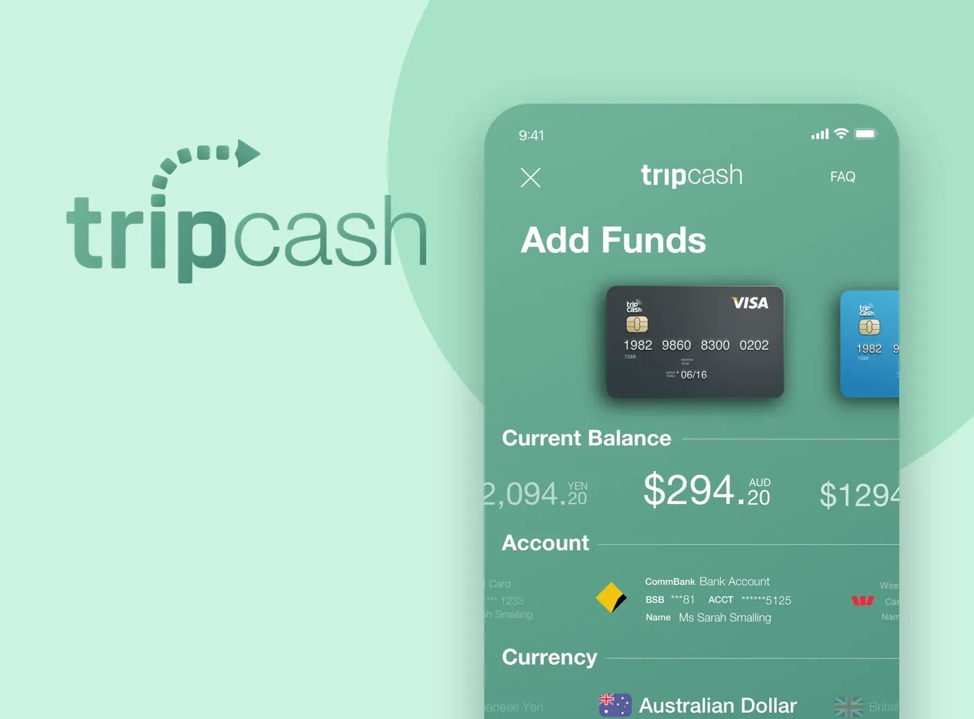
TripCash is a fin-tech startup co-developed by the TripCash team in Sydney and ASAP+ in Shanghai: a mobile wallet for spending your own funds in whichever country you travel to.
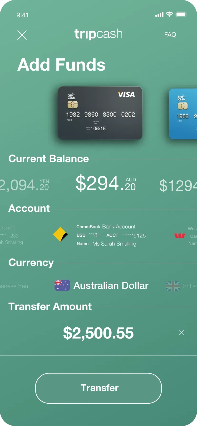
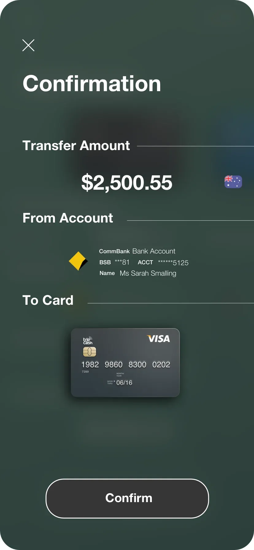
You transfer funds into your mobile wallet, exchange them into the currency you want to spend, issue yourself a debit card (VISA, MasterCard or UnionPay) and spend with the card or the onboard NFC function.
The idea was born from the frustration of Chinese tourists who wanted to spend their yuan but waited a long time for funds to arrive in the countries they were travelling to. TripCash solved that by allowing instant transfers from Chinese accounts into the wallet.
02 · Role and research
From raw idea to MVP.
I joined as Product Designer and Lead UX Designer to develop the front-end concept, running workshops in Sydney and Shanghai and several design iterations before the final wireframes and prototype.
My decisions were driven by the data we gathered and my own research into other banking and mobile wallet platforms, taking the product from its first concept to its MVP.
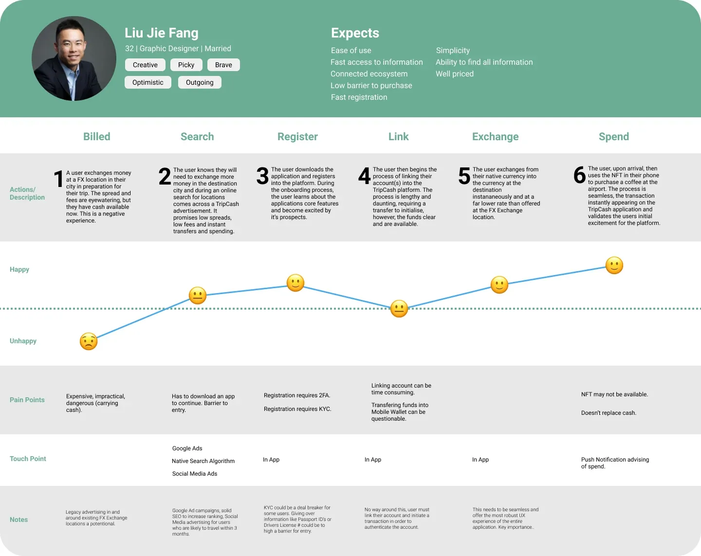
Discovery started in Shanghai with stakeholder vision sessions, brainstorming of core features and defining the MVP. Research then covered a traveller survey on pain points, personas, competitor wallet apps benchmarked on fees and exchange rates, and journey maps.
03 · Wireframes
Five key actions, mapped.
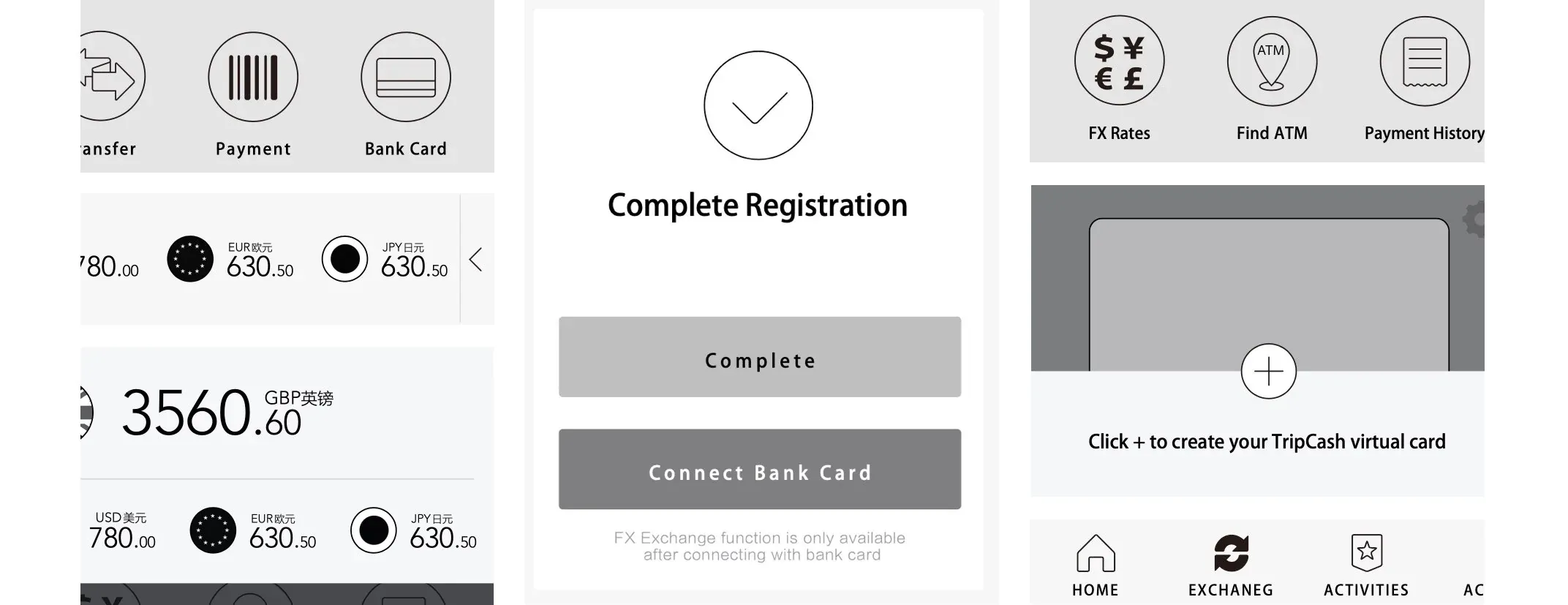
Low-fidelity wireframes of the key actions went to stakeholders first, then evolved into high-fidelity wireframes of every screen.
Each major screen and flow had a touch-point with stakeholders, and their feedback was built into the next iteration. The final visual design settled the font, colour palette and design system.
04 · Design decisions
Fewer steps, faster choices.
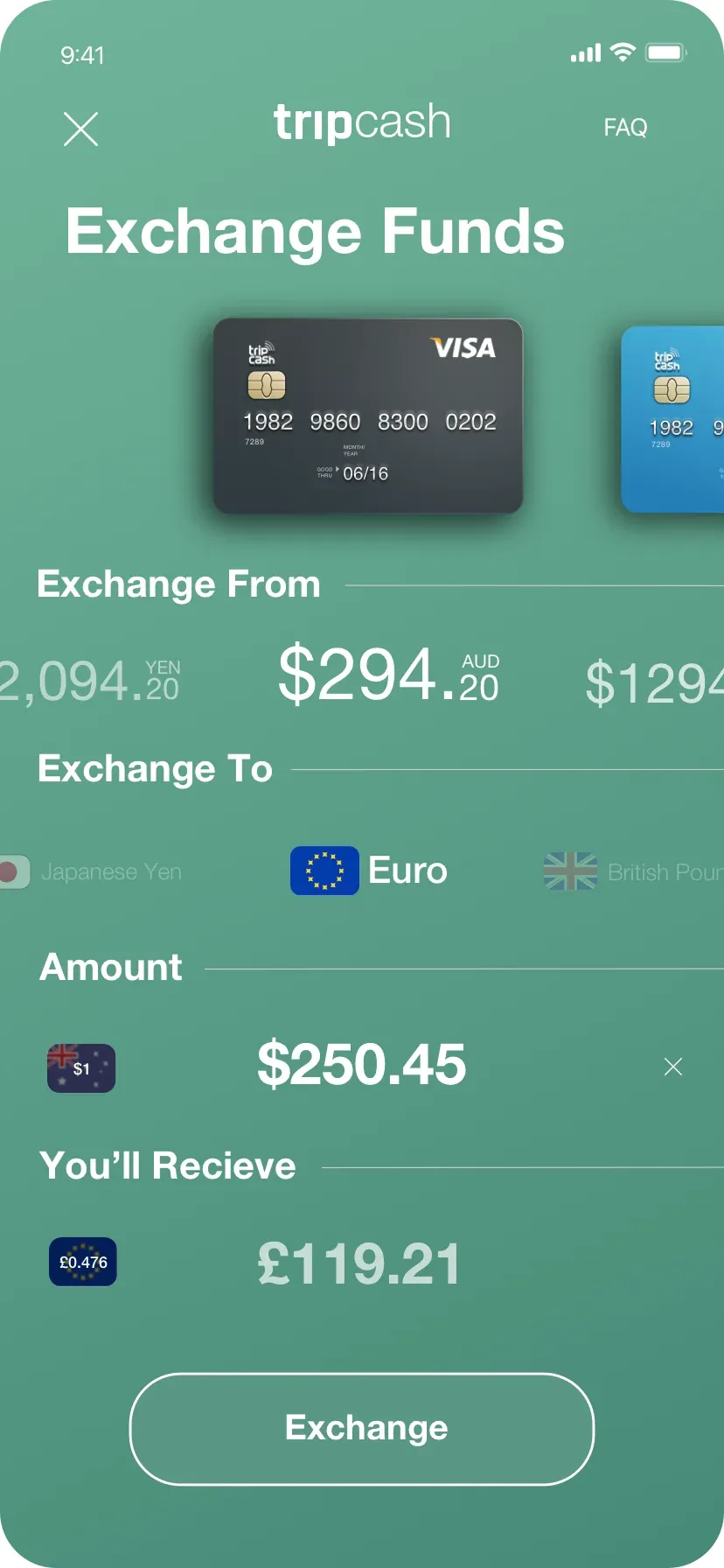
Horizontal sliders, flags for currencies and badges, each aimed at fewer steps, quicker recognition or more reuse.
Sliders for almost every multiple selection option. They cut the number of steps a task needs, and borrow from the mobile gaming culture that is prevalent in China, so people can choose intuitively without leaving a single relevant screen.
Flags in the currency conversion. They raise visual fidelity and let people who do not know a currency by name choose by the country it represents.
Badges as embedded gamification to drive engagement and reuse, linked to in-app targets such as printing a new card, making a forex exchange or linking a TravelFree account.
05 · TripCash tradeoffs
Small budget, big market.
Limited funds meant no in-depth usability testing, and Chinese funding meant designing around Alipay.
Staff from various departments and age ranges at the company in China usability tested the prototype.
The whole country runs on Alipay and introducing a new player is difficult, so letting users link their Alipay to the platform, and presenting that link as secure, was key.
Limited funds, so no in-depth usability testing.
Staff across departments and age ranges in China tested the prototype.
Part two

Now, TravelFree.
The wallet is where the money is made. TravelFree is the app that sends people to it.
From TripCash to TravelFree.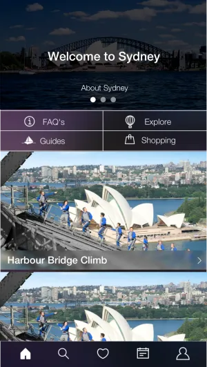
06 · TravelFree
A partner app for experiences.
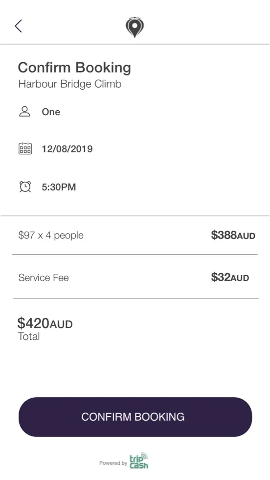
TravelFree lets people find deals and experiences in the city they are travelling to or in, book them and pay with their TripCash wallet.
The concept was to drive new and existing users to the TripCash wallet, where the money is made. Deals brokered with RedBalloon let TravelFree list their products, and travel guide startup Wandering Tom joined the ecosystem to deliver handmade travel guides, adding credibility and use cases.
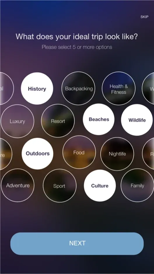
I developed the TravelFree idea and designed the app, running workshops in both Sydney and Shanghai before moving into an interactive design process. I would consider the result my best work yet, a content and feature rich mobile application in both concept and design.
07 · TravelFree design
Content that sells itself.
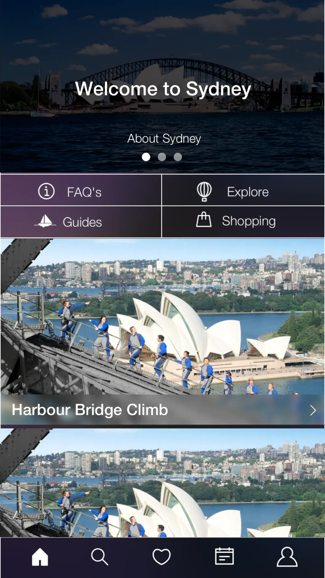
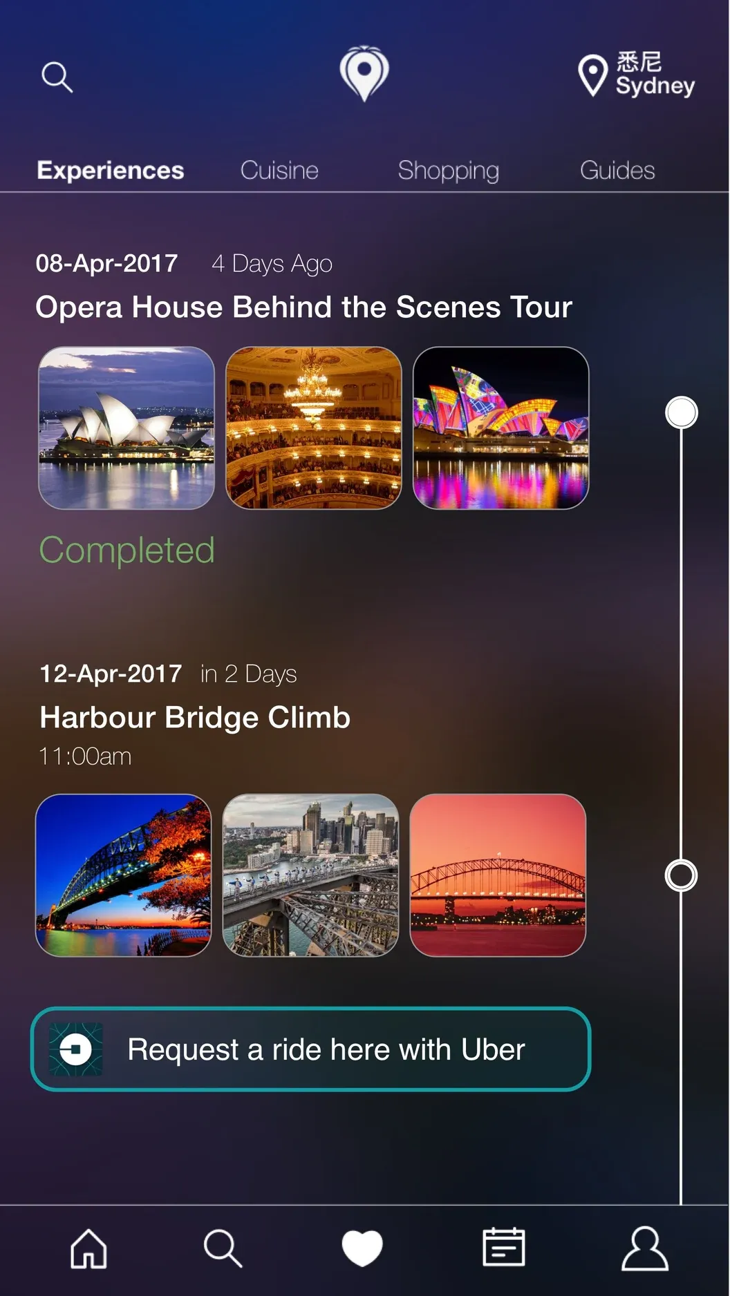
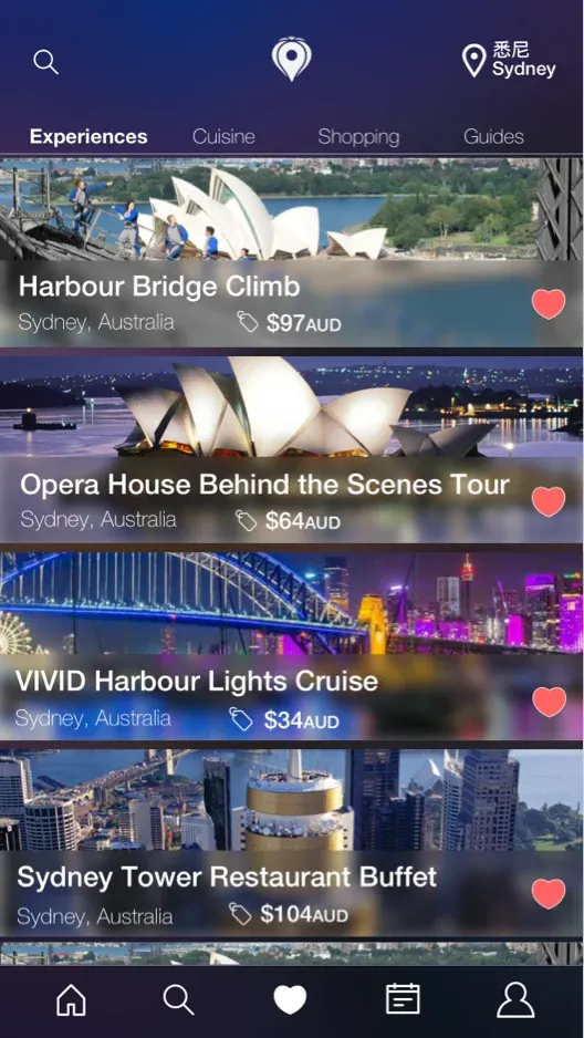
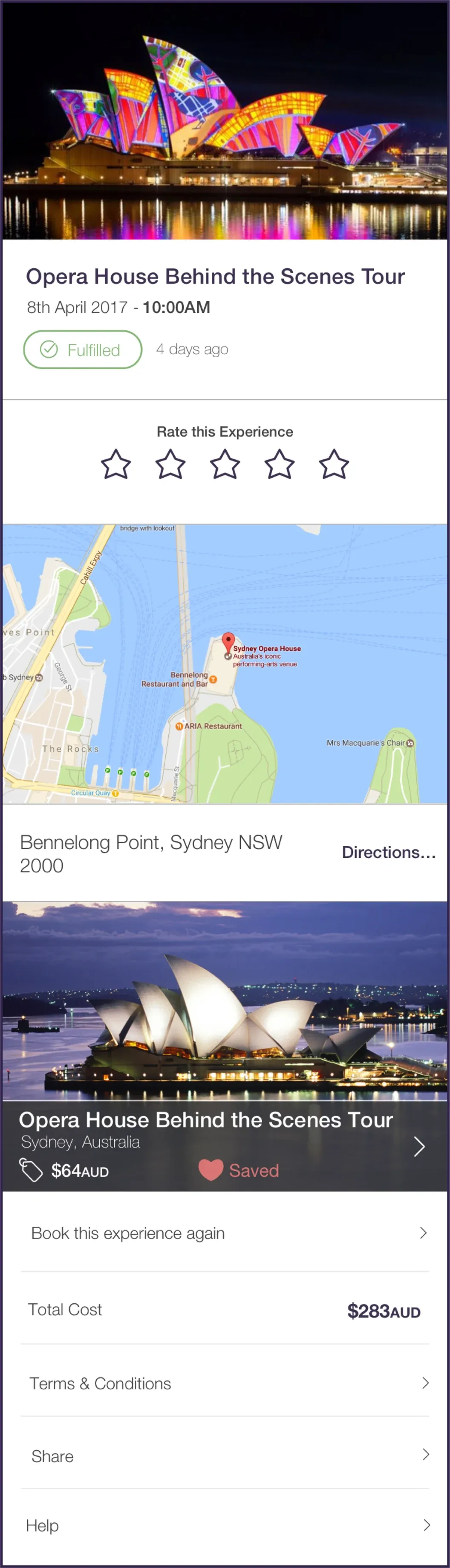
Images carry the product, and vertical scrolling in the style of Instagram and WeChat cuts the screens needed per action.
The focus was delivering content. The experience had to use striking images to sell each product and its information, so I designed around displaying images, drawing on workshop data and my own research to make something familiar and easy to use.
I drew on the vertical scrolling of Instagram and WeChat to show content and reduce the number of screens needed to complete an action.
08 · TravelFree tradeoffs
Wikitravel over crowdsourcing.
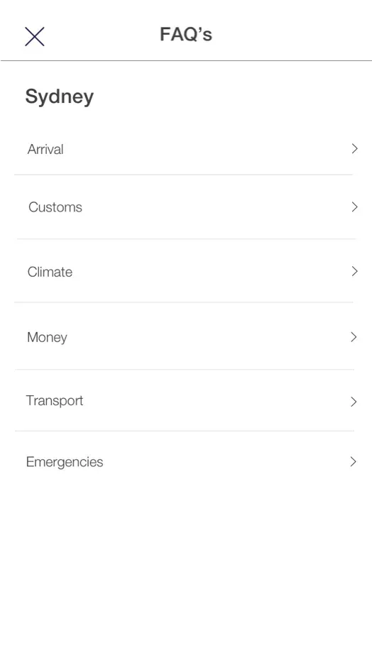
The business wanted users to crowdsource city information. I pitched pulling data from Wikitravel to populate the FAQs instead.
The concept was a one stop shop to find and book experiences and to understand where you are going, including the customs. My position was that crowdsourcing would be very difficult, and unless we paid for content upfront the product would be empty for almost all cities and countries.
Crowdsourced content would leave almost every city and country empty.
Populate the FAQs for each city and country from Wikitravel.

09 · In hindsight
What I would do differently.
I would push for funding for usability testing outside the Chinese market, and I would pull TravelFree off the TripCash home page.
Testing outside the Chinese market would have been difficult to get funded, but important.
At the time the push was to feature TravelFree on the home page to drive users from the financial product to the travel product. The products are inherently linked, but it lowered the visual fidelity of the first impression and overall trust in the brand, so I would reduce its importance.