Stanford Medicine
A new IA and wireframes to make a magazine’s stories easy to find.
- Information architecture
- Workshops
- Content block diagrams
- Wireframes
- IA firstFew UX hours, so I put the effort into information architecture and content discoverability
- ApprovedContent block diagrams secured approval of the layout and structure of pages
- The trade-offWireframes were turned around quickly and kept for internal use only.
01 · The brief
Modernise the site and the CMS.
Stanford Medicine Magazine wanted to modernise its website frontend and its backend CMS. As Lead UX Designer I drove a redesign to improve site usability and the editorial workflow.
The project had few UX hours allocated, so effort had to be prioritised and efficiencies found early. My approach was to focus on the IA and content discoverability.
Business goals
- Simplify editorial workflows
- Modernise the CMS for efficiency
- Enhance content discoverability
User needs
- Find articles easily
- Navigate the site intuitively
- Consume site content efficiently
02 · Discovery
Aligned first, then workshopped.
I started with an internal XD kickoff to align on project goals, then set up workshops with the stakeholder team to gather requirements and insights.
I facilitated a stakeholder UX workshop, refined the UX deliverables and identified audience archetypes.
03 · Information architecture
An IA built for discovery.
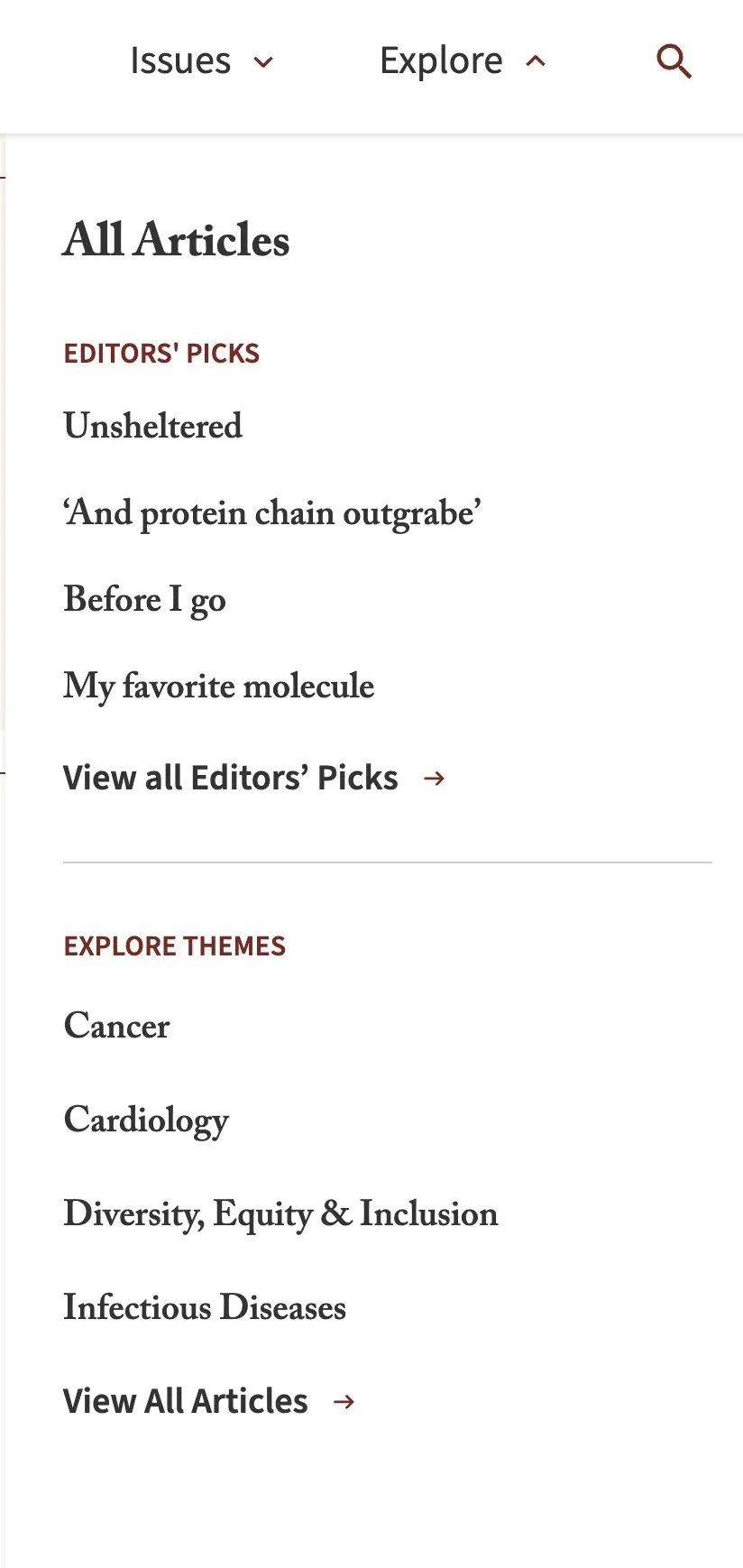
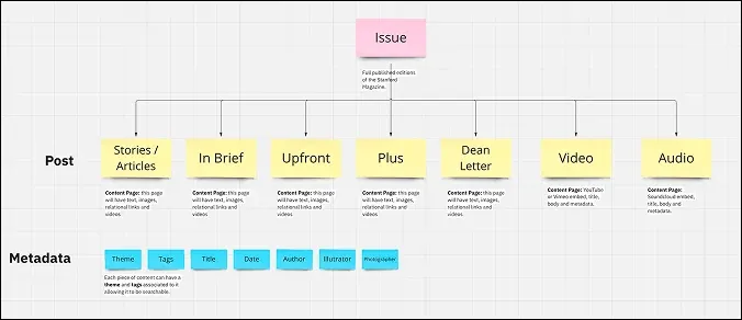
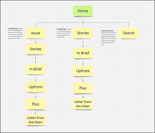
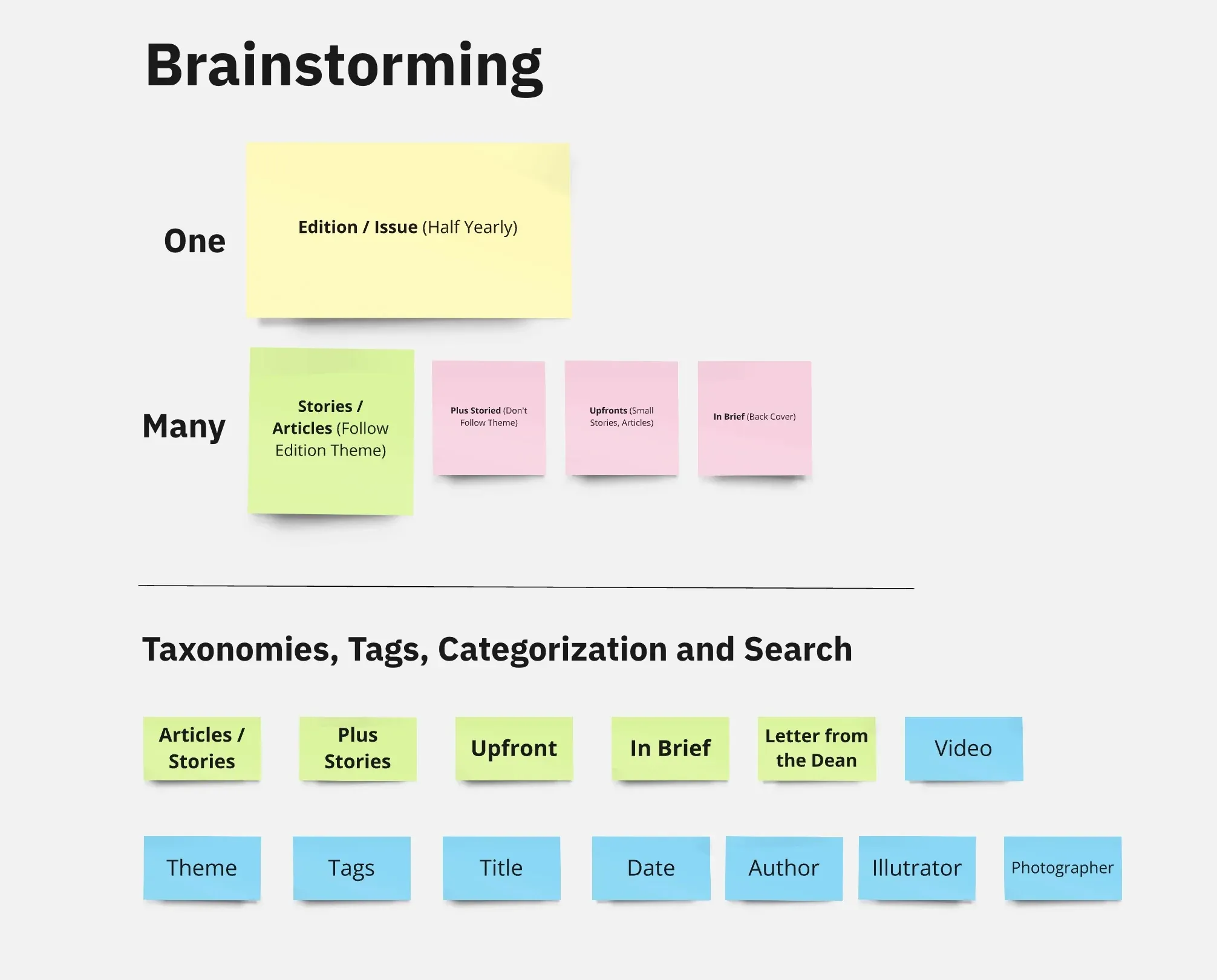
Following discovery and desk research, I developed the IA from both the current and the planned content. It became a pillar of the editorial experience and, above all, a way for readers to find stories.
I developed the site’s IA framework, defined the content taxonomies and iterated with client input.
04 · Content block diagrams
Blocks first, so layout got approved.
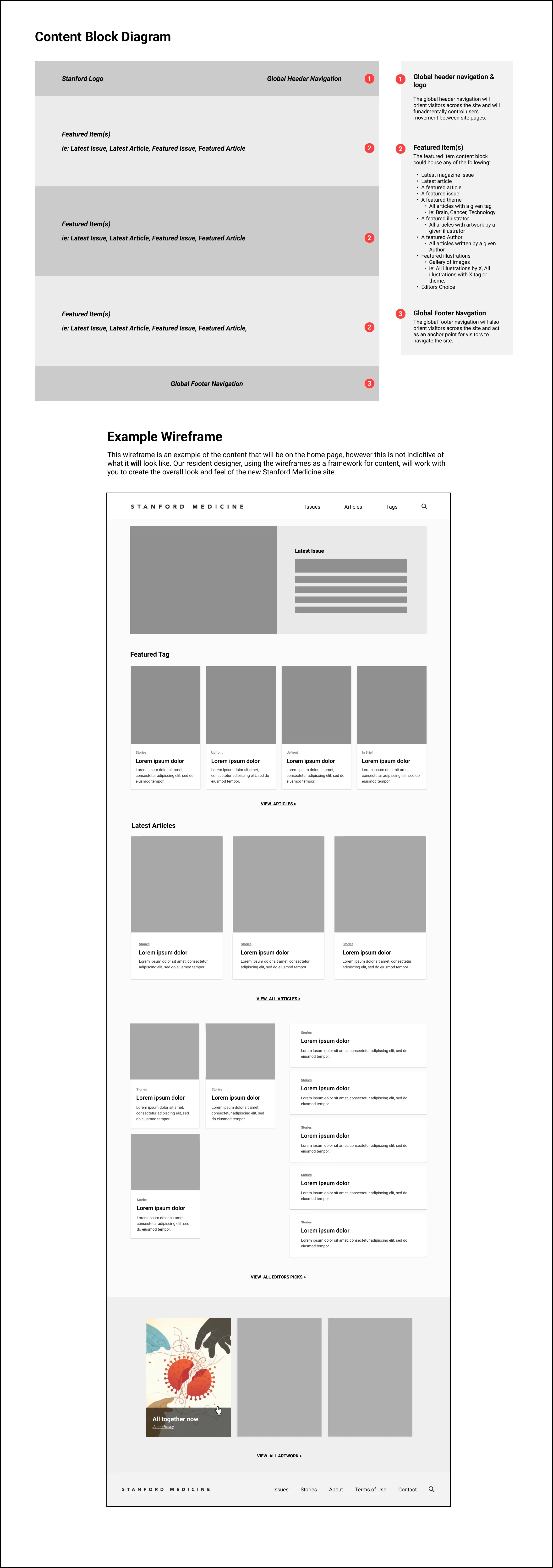
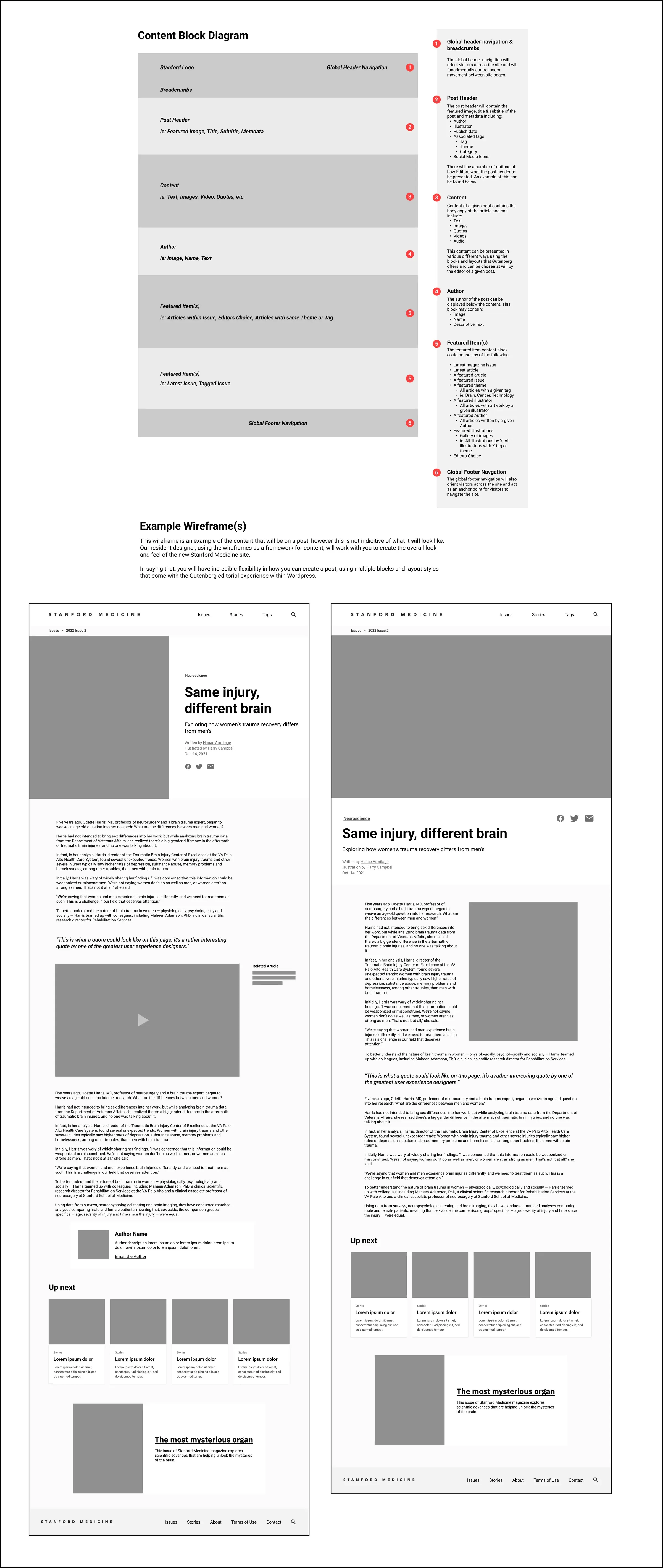
Content block diagrams were a good starting point, and they let us secure approval of the layout and structure of pages.
05 · Wireframes
Wireframes, turned around quickly.
Once the block diagrams were approved, and with a feel for the stakeholder team, I developed wireframes for internal use only and turned them around quickly.
The wireframes covered all pages and focused on usability and discoverability, with a reimagined navigational flow.
06 · Final design
The final design.
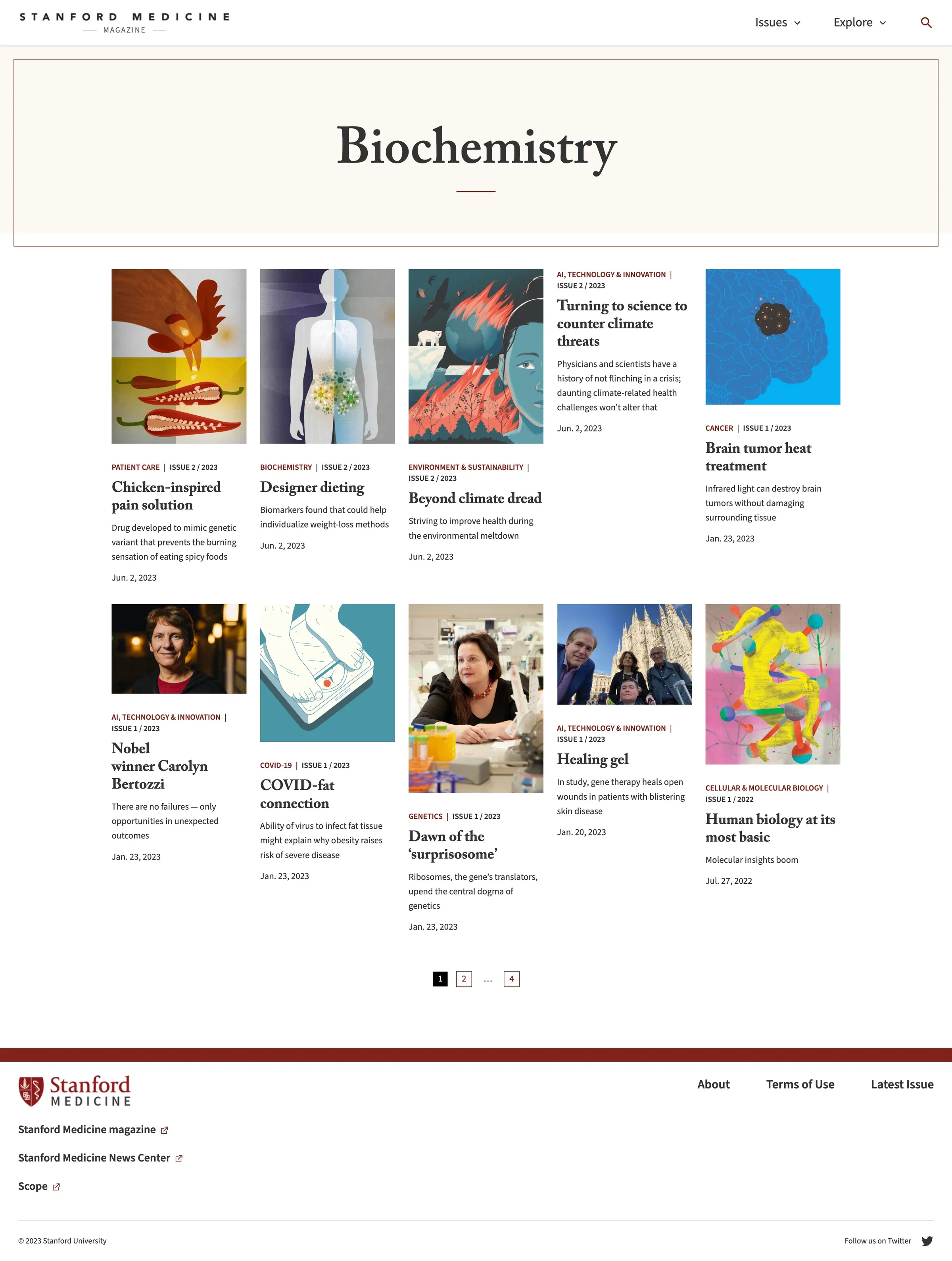
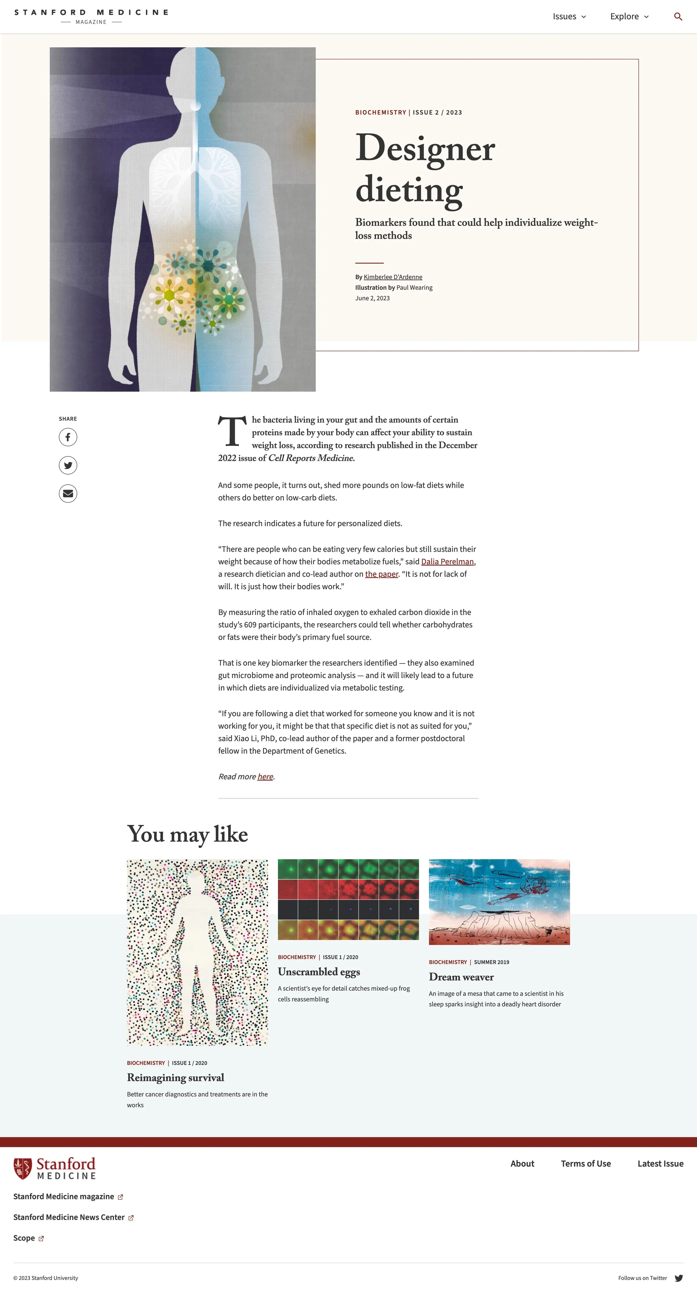
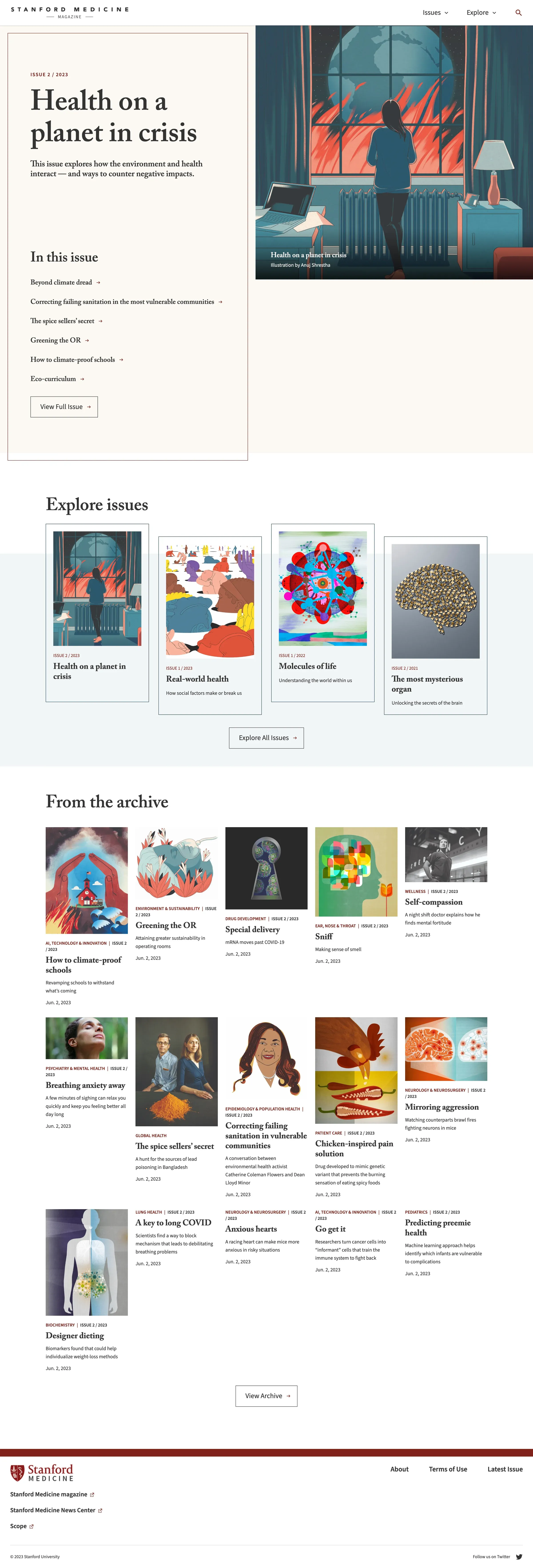
The final designs shipped with all of the UX enhancements from the IA, content block diagrams and wireframes intact.